What do you do with those hundreds of photos in your camera when you return home from holiday? You likely want to share them with friends and family by posting them on Facebook or some other photo-sharing site. But which ones?
Vagabondish is reader-supported. When you buy through links on our site, we may earn a small affiliate commission. Read our disclosure.
It can be difficult deciding which photos are best to upload. Sometimes people just give up and upload everything out of frustration. Or there are those friends that think I want to see every single image they took on their vacation. Both approaches are poor choices.
In my ebook, Capturing the Journey: A Beginner’s Guide to the Basics of Travel Photography, I touch on the importance of being selective about what photos you show other people. If your greatest photos get lost in all the mediocre ones, it’s only the mediocre you’ll be remembered for. Remember, it’s about quality, not quantity. Which brings us back to: how to choose?
In this post, I’ll review one method of narrowing down a batch of photos to a size that’s more manageable for you and your viewers. Following that, I’ll discuss choosing the best image out of a group of similar ones. To help you out I’ll use a few examples from my image library and go over my thought process for picking specific images.
Cutting it Down to Size
So how do you go about getting a large batch of images down to a more manageable size? One of the methods I prefer is to use the star rating system.

© Darin Rogers
Virtually every image editing/organizing program, such as iPhoto or Picasa, features some method for rating your photos. You can make use of this rating system to assist in making your selections.
The first step is to review and eliminate all the junk images: the blurry ones, the ones where you forgot to take off the lens cap, etc. Just delete those, unless you’re extremely sentimental. Then go through and pick the best of the rest and rate them with one star. Go through again and, out of the one-star photos, pick the two-star ones. Repeat until you have a five-star collection. It can be helpful to do this over a day or two to give yourself some distance. There may be other methods for culling a batch of images, you just need to find the one that works for you.
Picking the Best of the Rest
But what if you have two images, or several, that are similar? How do you decide between them? Well, it’s not always easy and often a somewhat subjective decision, like choosing which puppy is cutest out of a litter. But it depends on what you are trying to express with a particular image. I’ll give a couple examples and talk a bit about my decision process.
First Example
At first glance, the four pictures in this first example appear similar enough that it doesn’t matter which one I pick. But there are differences, and I want to present the one that best represents my vision.

© Darin Rogers
In the end, I chose the first image because I felt it best expressed what I was trying to portray with this scene. More specifically: the contrast between the old, traditional style architecture of the foreground temple and the modern, industrial background of shipyard cranes.
In Image 2 and 4, the open terrace area of the temple is not a particularly attractive part of the structure and is a bit of a distraction.
Image 1 places the most emphasis on the roof architectural elements. Additionally, using trees to frame a subject is often a useful technique.
However, in the case of Image 2, 3, and 4, I felt the foliage gave too much weight to the foreground.
The final image is below. Because this was taken in the harsh mid-day tropical sun, it’s rather flat. I decided to work with this rather than fight it by giving it a bit of color toning.
I also cropped it a bit to take some weight off the tree on the right and reduce the empty sky. Finally, one of the things I like about this image is how the decorations on the peak of the roof ”˜mirror’ the cranes in the background.

Temple and Shipyard, Keelung, Taiwan © Darin Rogers
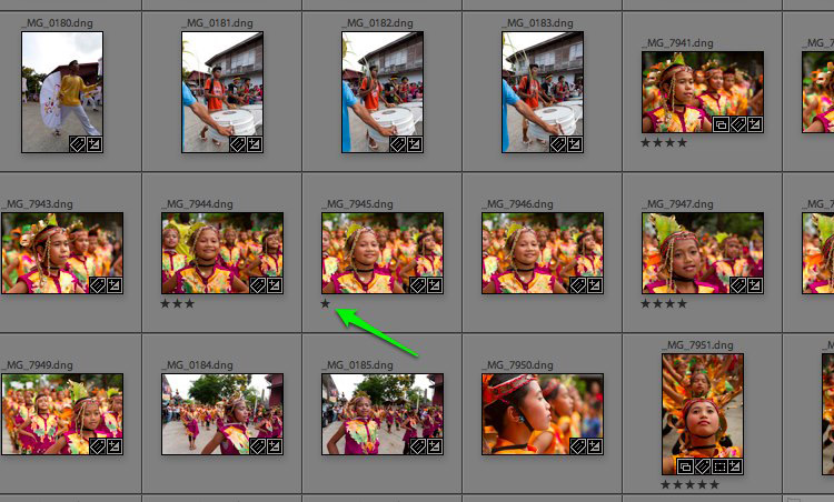
Second Example
In the second example, the four pictures appear almost exactly alike. But closer inspection reveals important differences.
Most significantly, in the first two I’ve relieved the poor soldier of his feet. If I had focused on his upper body, that would have been acceptable, but cutting off at the ankles is not. Image 2 is a bit underexposed, also. Image 3 is better but it still doesn’t leave much room at the bottom.

© Darin Rogers
Image 4 is the best of the four, although unfortunately this one ended up a bit crooked. Not to worry, though. Crooked is easy to fix, whereas it’s difficult to go back and add something, such as feet that haven’t been included in the first place. In the final image below, I straightened it, converted it to black and white and, similar to the previous image, added toning for a more historical feel.

Sun Yat-sen Memorial Hall, Taipei, Taiwan © Darin Rogers
Third Example
For my final example below, I again chose the first image. The differences between Image 1 and 2 are slight, but under close inspection, I prefer the position of the girl in Image 1 relative to the other girls in the line. There’s more space between each of the girls so it just ”˜feels’ more ”˜comfortable’.
You’ll notice also that in the first image the second girl in the line is looking towards the camera and smiling. Although she is secondary to the main subject, I find this livens up the interaction with the viewer. The third image suffers from the same ”˜space issues’ as the second image. Additionally, the expression of the girl in the third image with the closed mouth evokes a less open and engaging feeling.

© Darin Rogers
For the final image, I cropped a bit off the right side that I thought was unnecessary and too distracting. I debated ”˜fixing’ the scar on the side of the girl’s mouth, but I decided that she’s not a model and it wouldn’t be appropriate for what is essentially a documentary-style image.
")
Moriones Festival Parade, Gasan, Philippines © Darin Rogers
Finally …
Selecting the ”˜best’ image can be an art in and of itself. Again, many of these choices are subjective and someone else looking at the same images may have chosen different ones, or maybe the same ones for different reasons. In going through your own images, it’s unlikely you’ll have similar images with the same choices, but I hope this provides a general idea of some of the details you’ll want to start looking for when selecting your best photos.
Want to learn more? Check out Darin’s complete ebook “Capturing the Journey – A Beginner’s Guide to the Basics of Travel Photography” (available now for just $10!)